Source-art red
#FB0706Logo-derived brand emphasis and large display moments.
THE PIZZA BRAND, AT THE CENTER
A visual system for Forno Street Pizza Co.’s investor front door. Red, ink and white connect it to the restaurant brand; a disciplined reading layout gives the investment conversation room to breathe.
Julian selected Forno Street Pizza Co. as the lead brand, matching the supplied offering artwork. This is a source-backed website guide, not an official corporate brand manual.
The source-art red was sampled from the supplied logo image. Action red is adapted for white-text contrast. Supporting tones separate long-form content and maintain legibility.
#FB0706Logo-derived brand emphasis and large display moments.
#C8272EAccessible white-text calls to action; a website adaptation.
#171717Headline text and immersive dark surfaces.
#FFFFFFLogo breathing room and clean reading space.
#FAF7F2Long-form investor education and forms.
#F06A5EReadable red accents on an ink background.
Image sample: the most common red in the observed logo region was #FB0706. This is not a verified official brand-token declaration. The approved vector logo, brand manual and a current Forno consumer domain were not supplied or independently verified.
One primary action per view. Red carries the action; black and white carry the content. Do not turn every heading, card and link into a competing red callout.
5.55:1 · primary action text
16.78:1 · body copy and documents
5.91:1 · links and short accents
Bold, mixed-case Manrope headings make the story easier to scan. Comfortable body copy, generous spacing and clear contrast support questions, process and due diligence.
Weight 700–800 · mixed case · 1.1–1.2 line height · 32–80px responsive headings.
Explore the restaurant model, understand the roles and bring your questions to the team. Clear language does more work than a wall of financial claims.
Weight 400–600 · sentence case · 15–19px reading copy · generous line spacing · restrained measure.These are proposed website typefaces, not a claim about the fonts in the official logo. The approved logo artwork stays intact.
The original source mark leads. The investor website extends the identity through its layout rather than replacing it with a new symbol.
The display window isolates the original mark from the source artwork. It does not redraw the lettering or create a new vector logo.
Keep the pizza icon, outlined lettering, proportions and Pizza Co. attribution. The supplied mark uses a light background; retain a light surround until an approved dark-background variant is available.
Reserve at least one cap-height of clear space around the mark. Keep navigation, promotional copy and investor information outside that area.
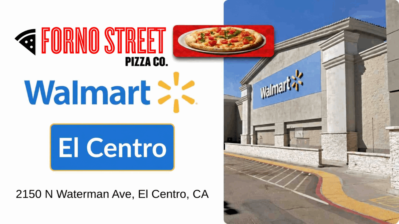
Walmart appears as retail context in John’s presentation. Do not turn a location reference into an investment endorsement or a co-branded investor logo.
Food establishes the brand. Verified, dated restaurant and team photography establishes evidence. Those jobs should stay clear.

The supplied Avestor art uses Forno Street Pizza Co and franchise language. Julian selected Forno Street Pizza Co. for this investor experience. This source art is shown intact as brand context; its franchise wording and food images are not new investment proof.
View the source offering page ↗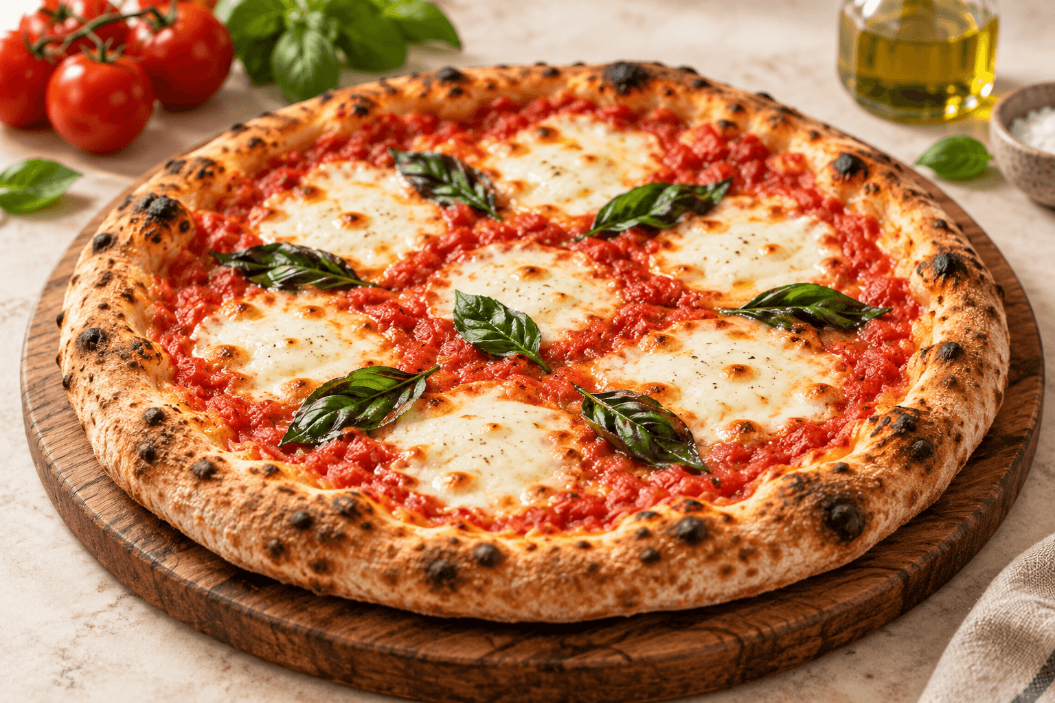
The illustrative pizza photograph establishes the visual direction for review. Replace it with owner-approved food photography before launch. It does not establish a restaurant’s opening, lease or operating status.
The guide separates observed references from proposed website choices and the current facts the team must confirm.
The current Avestor artwork shows Forno Street Pizza Co. Julian selected that lead identity. The displayed logo and sampled red come from this image, rather than an assumed official brand manual.
View the source offering page ↗John’s Fast Fired Phase 2 presentation supplies the model and consultation sequence. Its financial examples and dated opening expectations require current confirmation.
Watch the source presentation ↗The official Fast Fired website remains a separate source reference for the name used in John’s video. It does not establish a verified Forno rebrand or a current Forno consumer domain.
fastfired.ca ↗Obtain approved logo masters and any current brand manual. Confirm the current written offer, location and team assets, operating entities and fund relationships. Apply the approved Forno identity consistently while preserving the original video’s Fast Fired attribution.